Mac menu bar apps: what belongs up there, and what does not
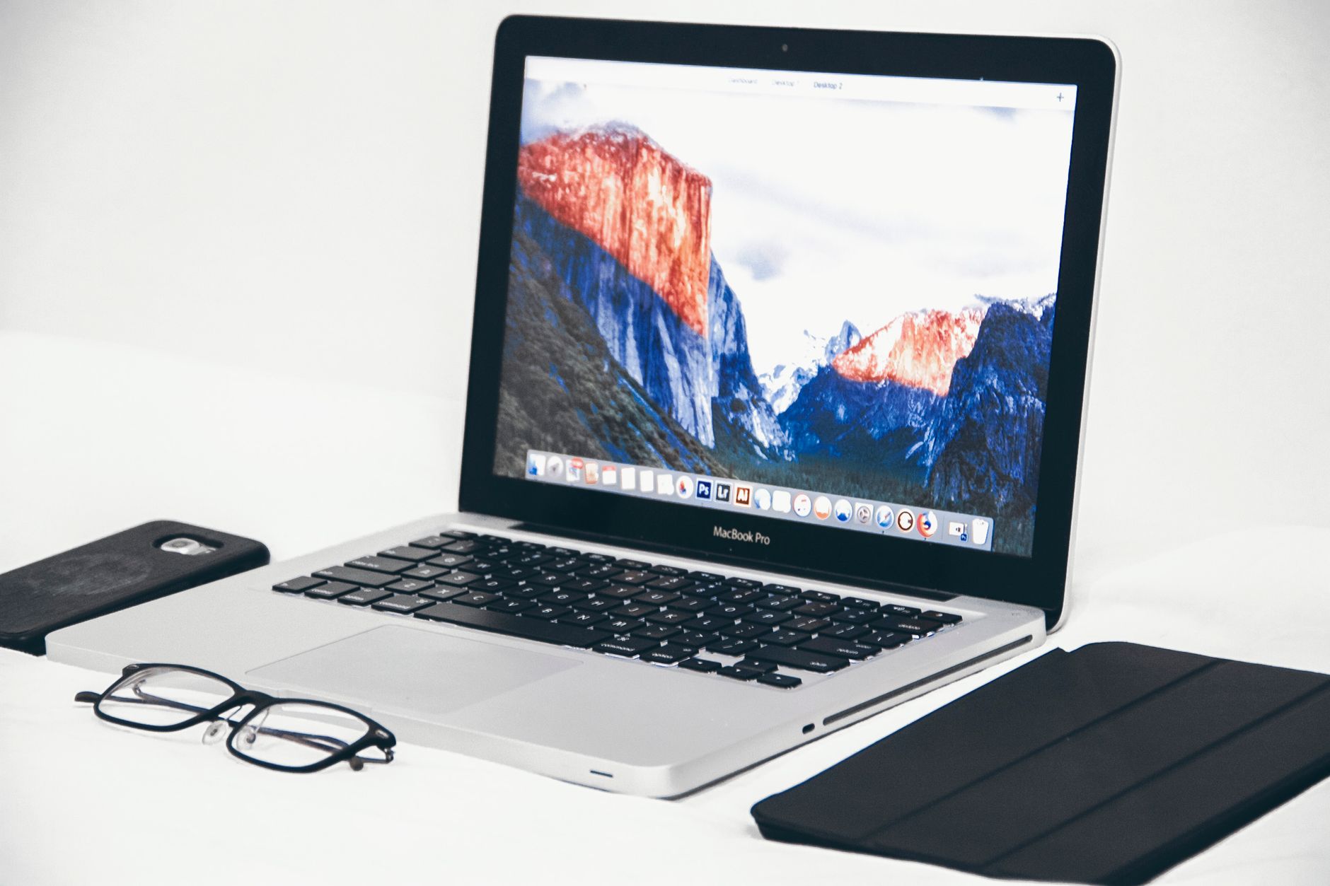
The phrase gets used for two unrelated things. Sometimes it means an application whose entire interface is a small icon at the top right of the screen, with no window and no Dock tile. Sometimes it means a utility whose job is to hide the other icons because there are now nineteen of them and the ones that matter have scrolled out of sight.
Both are worth understanding before installing anything, because the second problem is created by the first. Every menu bar app added is one more permanent claim on a strip of screen that has a hard limit, and that limit is smaller on a modern MacBook than it was ten years ago.
What a menu bar app actually is
Apple's own description of the region is precise about what it was designed for:
Toward the right end of the menu bar are items (sometimes called status menus), typically represented by icons, that let you check the status of your Mac (such as the battery charge) or customize features (such as keyboard brightness). Source: support.apple.com
Two words in that sentence carry the design: status and customize. The region was built for glanceable state and for quick toggles, not for places to do work.
Structurally, an application can be built to run with no Dock tile and no entry in the app switcher, presenting itself only as a status item. That is why menu bar apps feel weightless. They are also invisible to the usual ways of finding things: no Command-Tab entry, no window in Mission Control, and no obvious way to quit other than a menu inside the icon itself. An app that cannot be found through the app switcher is an app that has to be remembered, and remembering has a cost that grows with the count.
The categories that genuinely suit the format are narrow. Clipboard history, audio device switching, VPN state, battery detail, time tracking, and screenshot tools all share the same shape: a state to see or a switch to flip, in under two seconds, without leaving the current window.
The bar is finite, and the notch made it smaller
Status icons fill from the right toward the left. On a display with no interruption, they keep filling until they reach the application menus of whatever app is frontmost.
On a MacBook with a notch, the usable strip ends before the middle of the screen. Icons cannot be drawn behind the camera housing, so the count at which items start disappearing arrives sooner, and it moves depending on which application is frontmost, because an app with many menu titles pushes the boundary further right. This produces the confusing symptom people report: an icon that is present in one app and gone in another, with no setting changed.
External monitors make it stranger rather than better. Menu bar items are drawn per display, and a laptop screen with a notch plus a large external display gives two different amounts of room for the same set of icons. A layout tuned on the external monitor can therefore look broken the moment the laptop is undocked, which is the second most common version of this complaint.
The practical consequence is that the menu bar cannot be treated as a place to keep things. It is a fixed budget, and every addition spends from it.
What macOS gives before anything gets installed
Three built in behaviours cover a surprising amount of the problem.
Rearranging and removal are both keyboard modified drags:
To rearrange status menus, press and hold the Command key while you drag an icon. To quickly remove a status menu, press and hold the Command key while you drag the icon out of the menu bar. Source: support.apple.com
That single gesture is the highest value thing in this article. Dragging the icons that get clicked daily to the right end, next to the clock, and dragging everything else off the bar entirely, takes about a minute and does not require any software.
Control Center is the second lever. Items that only get touched occasionally can live inside it rather than on the bar, and Apple's guidance for the reverse case is short: Control-click the item, then choose Copy to Menu Bar or Add to Menu Bar. Anything that does not need to be visible at all times belongs in Control Center rather than beside the clock.
The third is hiding the bar itself. macOS can be set to show the menu bar only when the pointer moves to the top of the screen. That reclaims vertical space, at the cost of making every status icon a deliberate reach rather than a glance, which defeats the point for anything genuinely being monitored.
The tools that tidy the bar
When the built in options run out, dedicated managers take over. Two are commonly encountered and they are built on different premises.
| Bartender 6 | Ice | |
|---|---|---|
| Published by | Applause Group, Inc. | An open source project |
| Cost | Paid, licence purchased from the developer | Free |
| Licence | Commercial | GPL-3.0 |
| macOS supported | Built for macOS Tahoe and Sequoia | macOS 14 and later |
| Core function | Hiding and showing status items | Hiding and showing status items |
Bartender 6 is stated by its publisher as built for macOS Tahoe and Sequoia, with the earlier version recommended for older systems. Ice describes itself plainly:
Ice is a powerful menu bar management tool. While its primary function is hiding and showing menu bar items, it aims to cover a wide variety of additional features to make it one of the most versatile menu bar tools available. Source: github.com
Its README is also explicit that macOS 14 is the floor, on the basis that it relies on system APIs introduced there, and that the project is still under active development with features not yet implemented.
One thing both share is worth naming, and it is easy to miss while enjoying a suddenly clean bar. A manager does not reduce the number of running apps. It hides icons, which solves the visual problem and leaves the memory, the login items, and the update chores exactly as they were. Removing an app that is not used removes all three.
Deciding what earns a slot
A short test settles most cases. If the answer to the question is needed while looking at something else, it belongs in the menu bar. If reaching it means stopping what is being done and entering another interface, it belongs in the Dock.
Battery percentage, the current audio output, whether a VPN is connected, and how long a timer has been running are all answers. They are read in half a second and no window opens.
Email, calendars, issue trackers, chat, and admin panels are places. Each one is entered, worked in, and left. A menu bar dropdown makes them worse, because a panel that closes when focus moves elsewhere is a poor container for anything that takes more than a moment.
The middle case is the one worth being strict about. Something that gets checked constantly but also worked in, such as a chat tool, tends to end up in both places. Picking one is better than having two entry points to the same thing, and the Dock is usually the correct pick, because the Dock survives a click elsewhere and a dropdown does not.
Auditing what is already up there
Before adding anything, the existing set is worth one pass, because menu bar icons accumulate as a side effect of installing other software rather than by decision.
Read the icons from right to left and sort each one into three outcomes. Clicked this week, in which case it stays and moves toward the clock. Useful but rarely touched, in which case it goes into Control Center or gets its status item switched off in the app's own settings. Not recognised at all, which is more common than expected and is the interesting category.
An unrecognised icon usually belongs to something installed months ago for a single task, or to a helper that arrived alongside a larger application. Clicking it normally reveals a menu with the app's name and a quit option, which identifies it. If it is not needed, quitting is only half the job: many of these launch themselves again at the next startup.
That second half lives in System Settings, under General, then Login Items and Extensions. Background helpers register there, and switching one off stops it from returning. This is also where the difference between hiding and removing becomes concrete. Hiding an icon with a manager leaves the app running, with its memory use, its update checks, and its network activity intact. Disabling the login item removes all of it.
A reasonable target after a pass like this is between five and eight visible icons. That count fits comfortably beside the clock on a laptop screen, leaves room for the frontmost app's menus, and stays legible without hovering. Anything above roughly a dozen is where people start searching for a manager, and the audit often makes the manager unnecessary.
Websites do not become menu bar items
This is the limit that catches people out. A web service checked all day, such as an internal dashboard or a queue of incoming requests, cannot be put in the menu bar by any of the routes above. Status items come from applications built to provide them, and no browser feature produces one from a URL.
What a site can become is a real application with its own window, its own Dock tile, and its own entry in the app switcher. Safari on macOS Sonoma 14 and later does this from the File menu. Chromium browsers do it through the menu item that installs a page as an app. A dedicated web app wrapper for macOS does it too, and adds the parts those routes leave out, such as choosing the icon rather than inheriting a favicon and keeping separate sessions for two accounts of the same service. What those apps can be configured to do is set out under Features, and the services that come preconfigured are listed at Supported services.
Framed against the menu bar question, the outcome is better than it first sounds. Anything genuinely being monitored gets a Dock tile with a badge, which is the mechanism macOS provides for unread counts, and the menu bar stays free for the things that actually belong there.
What to change first
Spend one minute on the Command-drag pass before installing any manager: move the icons clicked daily to the right, and drag the rest off the bar. Then, for the web services being kept in the bar as a workaround, build them into real apps instead: Kagemusha does that from a URL, and the Dock is the right home for anything with a window.
Frequently asked questions
Why do some menu bar icons disappear on a MacBook with a notch?
Status icons fill from the right and cannot be drawn behind the camera housing, so the available strip ends before the middle of the screen. The exact cut off point moves depending on how many menus the frontmost application has, which is why an icon can be visible in one app and missing in another with nothing having been changed.
How do you remove a menu bar icon without uninstalling the app?
Hold Command and drag the icon out of the menu bar. Apple documents this as the quick way to remove a status menu, and the same modifier lets icons be dragged into a different order. Some apps also offer a setting to hide their status item, which is the more durable route since the icon may return after a restart otherwise.
Is a menu bar manager necessary, or is Control Center enough?
For most setups the built in options go further than expected. Command-drag removes what is not needed, and Control Center holds the items that only get touched occasionally, which frees the bar without adding another running app. A manager becomes worthwhile when a large number of icons must stay available rather than removed.
Can a website be turned into a menu bar app?
Not through the standard routes. Status menu items come from applications built to provide them, and no browser feature creates one from a URL. A site can be turned into a standalone Mac app with its own window and Dock tile, which also gives access to badge counts for unread items, and that is the mechanism macOS provides for keeping an eye on a web service.