Site shortcuts in the Dock alternatives: what you can drop
A Dock icon looks like one thing and does five. That is why the decision to put a website there feels harder than it should: the reason for wanting it is usually one of the five, and the effort of building it covers all five whether they are needed or not. Splitting the icon into its separate jobs makes the choice mechanical. Three of those jobs have substitutes that cost nothing and require no new app. Two of them do not, and those two are the only real argument for the icon.
The five jobs hiding inside one icon
Putting a site in the Dock buys exactly five things.
Fewer steps to open it. A visible signal that it is currently running. Notifications that arrive whether or not a browser is open. A place in the application switcher under its own name. And separation, so the window cannot be closed by accident along with everything else.
Anyone who can name which of these five is the actual motivation can stop reading after the matching section below. Anyone who wants all five is describing a standalone app, and the rest is detail.
Two questions that settle it in under a minute
Before comparing tools, two questions remove most of the ambiguity.
The first: if the browser were quit right now, would anything be lost. Not the tab, which can be reopened, but the awareness. A missed message, an alert that arrives while the machine sits idle, a queue that grows unwatched. Sites where the honest answer is nothing survive perfectly well as tabs, and everything below about substitutes applies to them.
The second: when the wrong window gets used by mistake, how expensive is that mistake. Reading a page in the wrong context costs nothing. Replying from the wrong account, deploying from the wrong environment, or posting into the wrong workspace costs a conversation at minimum. The higher that cost, the further along the separation scale the answer has to sit.
Those two answers between them decide four of the five jobs. Opening speed, the job most people think they are solving, turns out to be the one that never requires a Dock icon at all.
Opening speed is the cheapest job to replace
If the only complaint is the number of clicks between wanting the site and seeing it, the Dock is a mediocre answer. Dock icons shrink as the Dock fills, so the hunting time grows with every addition. Typing does not degrade that way.
Spotlight takes two or three characters to surface almost anything, and the keystroke stays the same whether five sites or fifty are in play. Third party launchers behave the same way with more configuration.
Bookmarks in a browser's bookmark bar can be reached positionally, so four or five daily sites placed at the left edge of that bar become a fixed keystroke each. For anyone whose browser is open all day anyway, this beats the Dock on raw step count, because there is no application switch involved at all.
The Shortcuts app that ships with macOS can hold an action that opens a URL, and that shortcut can be assigned a key combination. The result opens the site without any icon existing anywhere, which suits people who dislike visual clutter more than they dislike keyboards.
A URL file saved on the Desktop is the weakest version of this idea. It only works when the Desktop is visible, which for most full screen workflows means it works rarely.
All four options solve one job and only one. What opens is still a browser tab, so the remaining four jobs are untouched.
Finding it again without an icon
The second job, knowing where the site currently lives, has good substitutes inside the browser.
Pinning a tab narrows it and locks it to the left edge of the tab strip, where it survives closing every other tab in the window. With three or four daily sites, the eye learns fixed positions and the search cost drops to nearly zero.
Tab groups solve the same problem from the other direction by hiding everything that is not relevant right now. Switching groups clears the visual field without closing anything.
Separate desktops, or the staged window arrangement macOS offers, move whole browser windows out of sight instead of out of existence. The site stays loaded and stays out of the way.
What none of these survive is quitting the browser. That is the shared limitation of every in browser substitute, and it is the hinge the whole decision turns on.
Notifications are the job with almost no substitute
This is where substitution runs out.
A standalone web app created from Safari supports web push and badging, and unread counts appear on the Dock icon itself.
The number of unread notifications appears as a red badge on the app's icon in the Dock. Source: support.apple.com
A browser tab can receive notifications too, but only while the browser is running. Quit it at the end of the day and the channel closes with it. Some sites write an unread count into the page title, which a pinned tab renders too narrow to read.
Menu bar utilities cover a handful of popular services, and for those specific services they are a genuine alternative. For an internal system or a niche tool, that option simply does not exist.
There is also a difference between being notified and being able to see the backlog at a glance. A banner that appears and disappears answers the question of whether something happened. A number sitting on an icon answers the question of how much is waiting, which is the one that governs whether to open the thing at all. Substitutes generally provide the first and not the second, and people who describe a Dock icon as calming are usually describing the second.
So the question reduces to a single test. Does missing a message during the hours the browser is closed cost anything. If the answer is no, three of the five jobs are already solved by free substitutes and the icon is optional. If the answer is yes, keep reading, because the fifth job usually comes along with it.
Switching and separation come in three strengths
The application switcher does not see browser tabs. It sees one browser, which means every switch ends with a tab hunt. Three substitutes reduce that, in increasing order of separation.
Separate browser windows are the lightest. Switching becomes window based, but every window still announces itself as the browser, so telling them apart means looking inside.
Separate browser profiles are stronger. Sign in state, history, and extensions split cleanly, and some browsers add a visible mark to distinguish the windows. This is the level at which sending a message from the wrong account stops being possible.
A standalone app is the strongest, and the difference shows up in the switcher: the entry carries the service name and its own icon rather than the browser's. For someone switching dozens of times a day, that naming difference is the whole point.
One detail decides between the middle option and the strongest one. Browser profiles separate the data but not the identity in the switcher, so a fast switch still lands on something labelled as the browser. A standalone container separates both. Anyone who navigates mostly by keyboard notices the difference within a day, because the switcher becomes searchable by service name rather than by position.
Pick the level by asking what a mix up costs. Visual annoyance is a tab group problem. Posting to the wrong workspace is a profile problem or larger.
Where the substitutes quietly fail
Each substitute has a failure mode that only shows up weeks later, which is why lists of alternatives tend to oversell them.
A pinned tab survives closing other tabs, but not closing the window it lives in, and not a browser restart prompted by an update. Browsers restore pinned tabs on relaunch in most cases, and the exception is exactly the case that matters: a crash during a busy morning.
Bookmark positions shift the moment a new bookmark is added to the left of the existing ones, and the muscle memory built over a month breaks silently. Anyone relying on positional bookmarks should treat the leftmost four slots as reserved and add new entries only at the right.
Keyboard shortcuts created in the Shortcuts app collide with shortcuts claimed by whichever application is frontmost. The combination that works from the Finder may do something else entirely inside a design tool or a terminal, and the failure is silent rather than announced.
Separate profiles drift apart. Extensions installed in one do not appear in the other, and six months later the two windows behave differently for reasons nobody remembers. That is often desirable, but it should be a decision rather than a discovery.
Desktops and staged windows depend on the habit of moving between them. The moment a window gets dragged back to the main desktop for convenience, the separation stops existing while still appearing to be configured.
None of these are reasons to avoid the substitutes. They are reasons to know which one is being relied on.
What the Dock itself costs
The Dock is not free of constraints either, and they deserve a mention before anything gets moved into it.
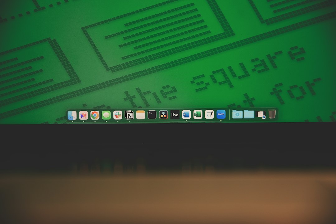
A divider splits the Dock into an application side and a files and folders side. A saved URL file is not an application, so it can only land on the second side, which is the part most people rarely look at. Getting an entry onto the application side requires something that is actually an app.
Icons come from whatever the site provides. Sites that supply nothing end up with a generic mark, which defeats the purpose of a visual shortcut.
And width is finite. Every addition shrinks the rest. A Dock holding twenty sites has recreated the original problem of too many similar looking tabs, just one layer down.
| Job | Substitute that needs no app | What the substitute gives up |
|---|---|---|
| Open it faster | Spotlight, bookmark bar, assigned key | Nothing meaningful |
| See where it is | Pinned tab, tab group, separate desktop | Disappears when the browser quits |
| Get notified | Browser tab notifications | Everything outside browser hours |
| Switch to it | Separate window or profile | A name and icon in the switcher |
| Keep it separate | Tab group, separate profile | Independence from closing the browser |
The top two rows are safe to drop. The bottom three are where the icon earns its place, and the third row usually decides the other two.
What to change first
Count the tabs that should still be alive after the browser quits. Zero means the free substitutes above are the right answer and no app needs building. One or two means those specific sites are worth turning into standalone apps, and everything else stays on a keystroke. The categories that end up in this group are visible in the supported services list, and what can actually be configured once a site becomes an app is listed under features, with the cost boundary set out on the pricing page. For the two or three sites that pass the test, a dedicated tool such as Kagemusha removes the browser from the equation entirely.
Frequently asked questions
Can a site be opened with a keyboard shortcut without putting anything in the Dock?
Yes. The Shortcuts app included with macOS can run an action that opens a URL, and that shortcut accepts a key combination. Spotlight and a positionally ordered bookmark bar achieve something similar with no setup at all. None of these provide notifications or a separate window, so they only replace the opening speed part of the job.
Why does a saved URL file land on the right side of the Dock?
The Dock is divided into an application area and a files and folders area, and a saved URL is a file rather than an application. Files can only occupy the second area, which sits to the right of the divider and tends to be overlooked. Getting an entry onto the application side requires an actual app bundle.
Is pinning a tab enough instead of building an app?
For three or four daily sites it usually is. A pinned tab narrows, locks to the left of the tab strip, and survives closing everything else in that window. It stops being enough when notifications need to arrive while the browser is closed, or when the application switcher should list the service under its own name.
How many sites can reasonably go in the Dock?
Fewer than most people expect, because the Dock has a fixed width and every addition shrinks the rest. A practical limit is the set of sites that need to outlive the browser session or deliver notifications. Everything else is better served by a keystroke, which does not get slower as the list grows.